Overview
In this module you will learn how to access and explore images in Earth Engine’s data catalog, visualize images using color composites, and practice interpreting satellite images using their spectral information.
Create a new script to follow along with the code in this lesson.
Accessing an Image
To begin, you will construct an image with the Code Editor.
var first_image = ee.Image(
    'LANDSAT/LT05/C02/T1_L2/LT05_118038_20000606');
When you click Run, Earth Engine will load an image captured by the Landsat 5 satellite on June 6, 2000. You will not yet see any output.
You can explore the image in several ways. To start, you can retrieve metadata (descriptive data about the image) by printing the image to the Code Editor’s Console panel:
print(first_image);
In the Console panel, you may need to click the expander arrows to show the information. You should be able to read that this image consists of 19 different bands. For each band, the metadata lists four properties, but for now let’s simply note that the first property is a name or label for the band enclosed in quotation marks. For example, the name of the first band is “SR_B1”.
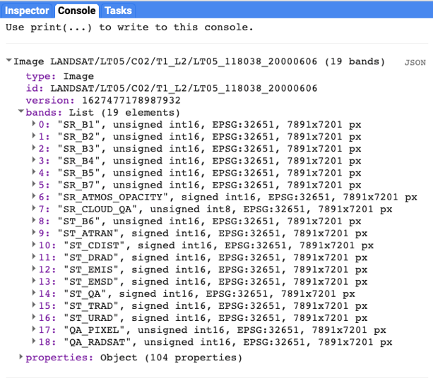
A satellite sensor like Landsat 5 measures the magnitude of radiation in different portions of the electromagnetic spectrum. The first six bands in our image (“SR_B1” through “SR_B7”) contain measurements for six different portions of the spectrum. The first three bands measure visible portions of the spectrum, or quantities of blue, green, and red light. The other three bands measure infrared portions of the spectrum that are not visible to the human eye.
An image band is an example of a raster data model, a method of storing geographic data in a two-dimensional grid of pixels, or picture elements. In remote sensing, the value stored by each pixel is often called a Digital Number or DN. Depending on the sensor, the pixel value or DN can represent a range of possible data values.
Some of this information, like the names of the bands and their dimensions (number of pixels wide by number of pixels tall), we can see in the metadata. Other pieces of information, like the portions of the spectrum measured in each band and the range of possible data values, can be found through the Earth Engine Data Catalog (which is described in the next two chapters) or with other Earth Engine methods. These will be described in more detail later in the book.
Visualizing an Image
Now let’s add one of the bands to the map as a layer so that we can see it.
Map.addLayer(
    first_image, //  dataset to display
    {
        bands: ['SR_B1'], //  band to display
        min: 8000, //  display range
        max: 17000
    },
    'Layer 1' //  name to show in Layer Manager
);
The code here uses the addLayer method of the map in the Code Editor. There are four important components of the command above:
first_image: This is the dataset to display on the map.
bands: These are the particular bands from the dataset to display on the map. In our example, we displayed a single band named “SR_B1”.
min, max: These represent the lower and upper bounds of values from “SR_B1” to display on the screen. By default, the minimum value provided (8000) is mapped to black, and the maximum value provided (17000) is mapped to white. The values between the minimum and maximum are mapped linearly to grayscale between black and white. Values below 8000 are drawn as black. Values above 17000 are drawn as white. Together, the bands, min, and max parameters define visualization parameters, or instructions for data display.
Layer 1: This is a label for the map layer to display in the Layer Manager. This label appears in the dropdown menu of layers in the upper right of the map.
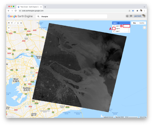
When you run the code, you might not notice the image displayed unless you pan around and look for it. To do this, click and drag the map towards Shanghai, China. (You can also jump there by typing “Shanghai” into the Search panel at the top of the Code Editor, where the prompt says Search places and datasets…) Over Shanghai, you should see a small, dark, slightly angled square. Use the zoom tool (the + sign, upper left of map) to increase the zoom level and make the square appear larger.
Can you recognize any features in the image? By comparing it to the standard Google map that appears under the image (as the base layer), you should be able to distinguish the coastline. The water near the shore generally appears a little lighter than the land, except perhaps for a large, light-colored blob on the land in the bottom of the image.
Let’s explore this image with the Inspector tool. When you click on the Inspector tab on the right side of the Code Editor, your cursor should now look like crosshairs. When you click on a location in the image, the Inspector panel will report data for that location under three categories as follows:
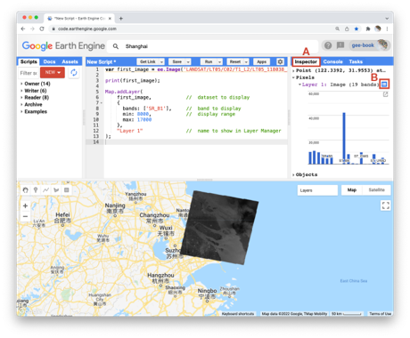
Point: data about the location on the map. This includes the geographic location (longitude and latitude) and some data about the map display (zoom level and scale).
Pixels: data about the pixel in the layer. If you expand this, you will see the name of the map layer, a description of the data source, and a bar chart. In our example, we see “Layer 1” is drawn from an image dataset that contains 19 bands. Under the layer name, the chart displays the pixel value at the location that you clicked for each band in the dataset. When you hover your cursor over a bar, a panel will pop up to display the band name and “band value” (pixel value). To find the pixel value for “SR_B1”, hover the cursor over the first bar on the left. Alternatively, by clicking on the little blue icon to the right of “Layer 1”, you will change the display from a bar chart to a dictionary that reports the pixel value for each band.
Objects: data about the source dataset. Here you will find metadata about the image that looks very similar to what you retrieved earlier when you directed Earth Engine to print the image to the Console.
Let’s add two more bands to the map.
Map.addLayer(
    first_image,
    {
        bands: ['SR_B2'],
        min: 8000,
        max: 17000
    },
    'Layer 2',
    0, //  shown
    1 //  opacity
);

Map.addLayer(
    first_image,
    {
        bands: ['SR_B3'],
        min: 8000,
        max: 17000
    },
    'Layer 3',
    0, //  shown
    0 //  opacity
);
In the code above, notice that we included two additional parameters to the Map.addLayer call. One parameter controls whether or not the layer is shown on the screen when the layer is drawn. It may be either 1 (shown) or 0 (not shown). The other parameter defines the opacity of the layer, or your ability to “see through” the map layer. The opacity value can range between 0 (transparent) and 1 (opaque).
Do you see how these new parameters influence the map layer displays? For Layer 2, we set the shown parameter as 0. For Layer 3, we set the opacity parameter as 0. As a result, neither layer is visible to us when we first run the code. We can make each layer visible with controls in the Layers manager checklist on the map (at top right). Expand this list and you should see the names that we gave each layer when we added them to the map. Each name sits between a checkbox and an opacity slider. To make Layer 2 visible, click the checkbox. To make Layer 3 visible, move the opacity slider to the right.
By manipulating these controls, you should notice that these layers are displayed as a stack, meaning one on top of the other. For example, set the opacity for each layer to be 1 by pushing the opacity sliders all the way to the right. Then make sure each box is checked next to each layer so that all the layers are shown. Now you can identify which layer is on top of the stack by checking and unchecking each layer. If a layer is on top of another, unchecking the top layer will reveal the layer underneath. If a layer is under another layer in the stack, then unchecking the bottom layer will not alter the display (because the top layer will remain visible). If you try this on our stack, you should see that the list order reflects the stack order, meaning that the layer at the top of the layer list appears on the top of the stack. Now compare the order of the layers in the list to the sequence of operations in your script. What layer did your script add first and where does this appear in the layering order on the map?
Code Checkpoint: https://code.earthengine.google.com/7cc6018541d665812d63be0a77040490
True-Color Composites
Using the controls in the Layers manager, explore these layers and examine how the pixel values in each band differ. Does Layer 2 (displaying pixel values from the “SR_B2” band) appear generally brighter than Layer 1 (the “SR_B1” band)? Compared with Layer 2, do the ocean waters in Layer 3 (the “SR_B3” band) appear a little darker in the north, but a little lighter in the south?
We can use color to compare these visual differences in the pixel values of each band layer all at once as an RGB composite. This method uses the three primary colors (red, green, and blue) to display each pixel’s values across three bands.
To try this, add this code and run it.
Map.addLayer(
    first_image,
    {
        bands: ['SR_B3', 'SR_B2', 'SR_B1'],
        min: 8000,
        max: 17000
    },
    'Natural Color');
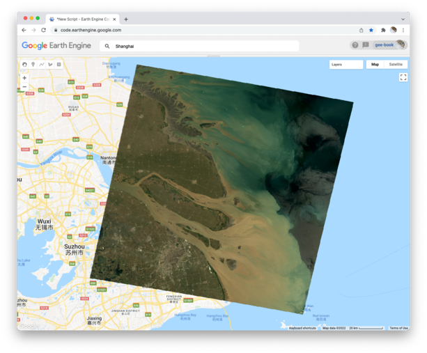
The result looks like the world we see, and is referred to as a natural-color composite, because it naturally pairs the spectral ranges of the image bands to display colors. Also called a true-color composite, this image shows the red spectral band with shades of red, the green band with shades of green, and the blue band with shades of blue. We specified the pairing simply through the order of the bands in the list: B3, B2, B1. Because bands 3, 2, and 1 of Landsat 5 correspond to the real-world colors of red, green, and blue, the image resembles the world that we would see outside the window of a plane or with a low-flying drone.
False-Color Composites As you saw when you printed the band list, a Landsat image contains many more bands than just the three true-color bands. We can make RGB composites to show combinations of any of the bands—even those outside what the human eye can see. For example, band 4 represents the near-infrared band, just outside the range of human vision. Because of its value in distinguishing environmental conditions, this band was included on even the earliest 1970s Landsats. It has different values in coniferous and deciduous forests, for example, and can indicate crop health. To see an example of this, add this code to your script and run it.
Map.addLayer(
    first_image,
    {
        bands: ['SR_B4', 'SR_B3', 'SR_B2'],
        min: 8000,
        max: 17000
    },
    'False Color');
In this false-color composite, the display colors no longer pair naturally with the bands. This particular example, which is more precisely referred to as a color-infrared composite, is a scene that we could not observe with our eyes, but that you can learn to read and interpret. Its meaning can be deciphered logically by thinking through what is passed to the red, green, and blue color channels.
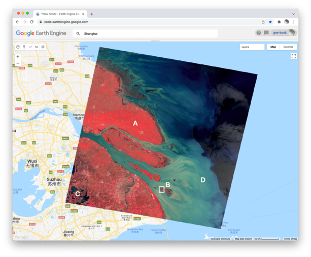
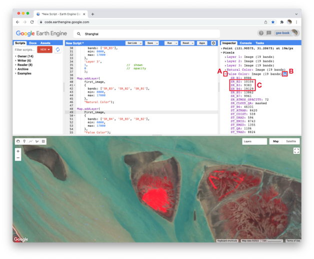
Notice how the land on the northern peninsula appears bright red (area A). This is because for that area, the pixel value of the first band (which is drawing the near-infrared brightness) is much higher relative to the pixel value of the other two bands. You can check this by using the Inspector tool. Try zooming into a part of the image with a red patch (area B) and clicking on a pixel that appears red. Then expand the “False Color” layer in the Inspector panel (area A), click the blue icon next to the layer name (area B), and read the pixel value for the three bands of the composite (area C). The pixel value for B4 should be much greater than for B3 or B2.
In the bottom left corner of the image (area C), rivers and lakes appear very dark, which means that the pixel value in all three bands is low. However, sediment plumes fanning from the river into the sea appear with blue and cyan tints (area D). If they look like primary blue, then the pixel value for the second band (B3) is likely higher than the first (B4) and third (B2) bands. If they appear more like cyan, an additive color, it means that the pixel values of the second and third bands are both greater than the first.
In total, the false-color composite provides more contrast than the true-color image for understanding differences across the scene. This suggests that other bands might contain more useful information as well. We saw earlier that our satellite image consisted of 19 bands. Six of these represent different portions of the electromagnetic spectrum, including three beyond the visible spectrum, that can be used to make different false-color composites. Use the code below to explore a composite that shows shortwave infrared, near infrared, and visible green.
Map.addLayer(
    first_image,
    {
        bands: ['SR_B5', 'SR_B4', 'SR_B2'],
        min: 8000,
        max: 17000
    },
    'Short wave false color');
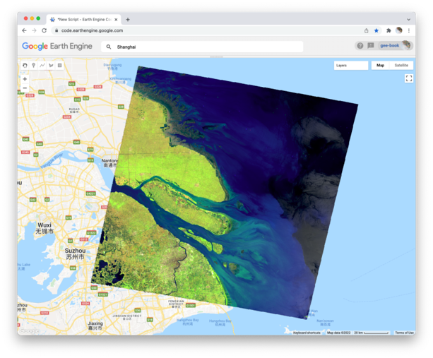
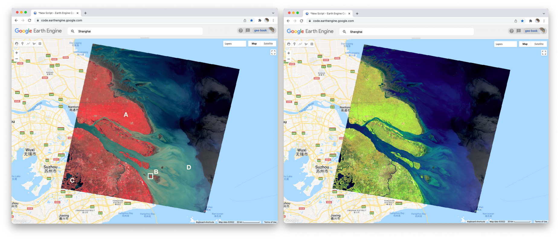
To compare the two false-color composites, zoom into the area shown in the two pictures of the figure below. You should notice that bright red locations in the left composite appear bright green in the right composite. Why do you think that is? Does the image on the right show new distinctions not seen in the image on the left? If so, what do you think they are?
Code Checkpoint: https://code.earthengine.google.com/022a47a4bdce895f830eceac85693313