Script
The script of this section is available here.
Precipitation Data
In this section, we will review how to import, visualize, and get precipitation data. High precipitation levels can determine whether floodings are observed. We will use the CHIRPS (Climate Hazards Group InfraRed Precipitation With Station Data) daily data, which provides daily global data at 5.5 km from 1981 to present.
Steps
- Import collections and visualize precipitation map
- Create a chart
- Time series of monthly data
1. Import collections and visualize precipitation map
// Define country boundaries
var suriname = ee.FeatureCollection('projects/caribbean-trainings/assets/suriname-2023/boundary');
Map.addLayer(suriname, {}, 'Suriname');

// Import the CHIRPS daily precipitation data:
var chirps = ee.ImageCollection("UCSB-CHG/CHIRPS/DAILY");
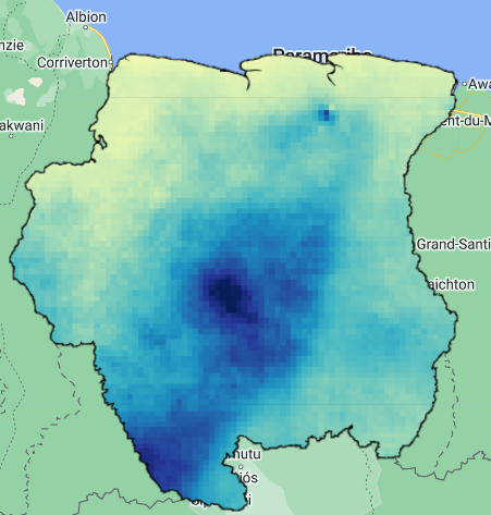
Now, we must filter the CHIRPS collection. We will use the a time range that covers March of 2022, where severe floodings where reported in Suriname. Then we sum the data from March using .sum() and then clip it to the Suriname polygon.
// Filter collection
// Focus on March 2022
var prec = chirps
            .filterDate('2022-03-01','2022-03-31')
            .filterBounds(suriname);

// Get cumulative precipitation of the month and clip it.
var precMonth = prec.sum().clip(suriname);

// Craete precipitation palette and visualize map
var palette = ['ffffd9','edf8b1','c7e9b4','7fcdbb','41b6c4','1d91c0','225ea8','253494','081d58'];
Map.addLayer(precMonth,{min:0, max:850, palette:palette},'Precipitation');
2. Create a chart
We can get daily values of precipitation at an individual point or location for March 2022 and plot it. In this case, we require to draw a point in the area where higher precipitations were observed, and then create a chart using the ui.Chart.image.seriesByRegion() function.
// Draw a pin in the area of higher observed precipitation (uncomment "var pin" if needed)
//var pin = /* color: #d63000 */ee.Geometry.Point([-56.08198200121426, 3.77768041314967]);

// Create chart of monthly precipitation:
var precChart = ui.Chart.image.seriesByRegion({
  imageCollection: prec,
  regions: pin,
  reducer: ee.Reducer.mean(),
  scale: 5500,
});
We need to print the variable containing the chart to visualize it. But, before doing that let’s set some settings. We can set the type of chart by using .setChartType() and set more options with .setOptions(). We will use the 'ColumnChart' type, but other types are available such as 'ScatterChart', 'LineChart', 'BarChart','PieChart', 'AreaChart'. More info about chart styling can be found here.
// Set chart type
precChart.setChartType('ColumnChart');

// Chart settings
precChart.setOptions({
  title: 'Daily Precipitation',
  vAxis: {
    title: 'Precipitation (mm)',
  }
});

// Print chart
print(precChart);

3. Time series of monthly data
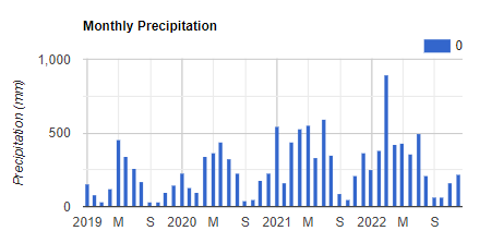
Another way to explore the precipitation seasonality and changes over time is plotting time series data. For this example we will calculate monthly precipitation data over the period 2019-01-01 - 2022-12-31. Let’s define some variables first:
// Define initial and end dates:
var iniDate = '2019-01-01';
var endDate = '2022-12-31';

// List of months and years of interest, and create reducer
var months = ee.List.sequence(1, 12);
var years = ee.List.sequence(2019, 2022);
var sum = ee.Reducer.sum();
The next function will help to get monthly precipitation data over a defined period of months and years, in a numerically format, as defined in the variables months and years. Additionally, for this function to run it is required an image collection, and a specified reducer, which need to be ee.Reducer.sum().
// Function to get time series of monthly precipitation data
function monthlyData(collection, years, months, reducer){
  var mapYears = years.map(function(y){
    return months.map(function(m){
      var process = collection
                .filter(ee.Filter.calendarRange(y, y, 'year'))
                .filter(ee.Filter.calendarRange(m, m, 'month'))
                .reduce(reducer)
                .set('month', m)
                .set('year', y)
                .set("system:time_start", ee.Date.fromYMD(y, m, 1).millis());
      return process;
    });
  });
  return mapYears;
}
We proceed to prepare our collection by filtering and applying the function to get monthly precipitation:
// Filter collection
var prec2 = chirps
            .filterDate(iniDate, endDate)
            .filterBounds(pin);

// Apply function and transform data to ee.Images
var precMonthly = ee.ImageCollection.fromImages(monthlyData(prec2, years, months, sum).flatten());
Now, the collection of the variable precMonthly is ready to be plotted:
// Create chart of monthly precipitation:
var precChartMonthly = ui.Chart.image.seriesByRegion({
  imageCollection: precMonthly,
  regions: pin,
  reducer: ee.Reducer.mean(),
  scale: 5500,
});

// Set chart type
precChartMonthly.setChartType('ColumnChart');

// Chart settings
precChartMonthly.setOptions({
  title: 'Monthly Precipitation',
  vAxis: {
    title: 'Precipitation (mm)',
  }
});

// Print chart
print(precChartMonthly);
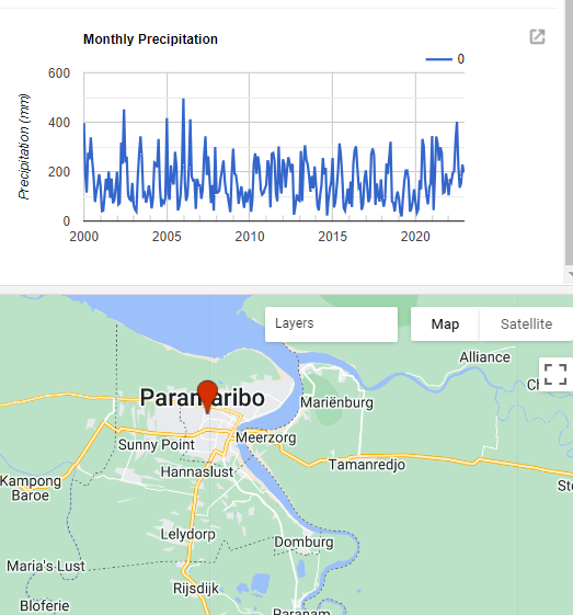
We can see that March 2022 had the highest precipitation in the period 2019-2022, which coincide with the flooding events in Suriname.
Exercises
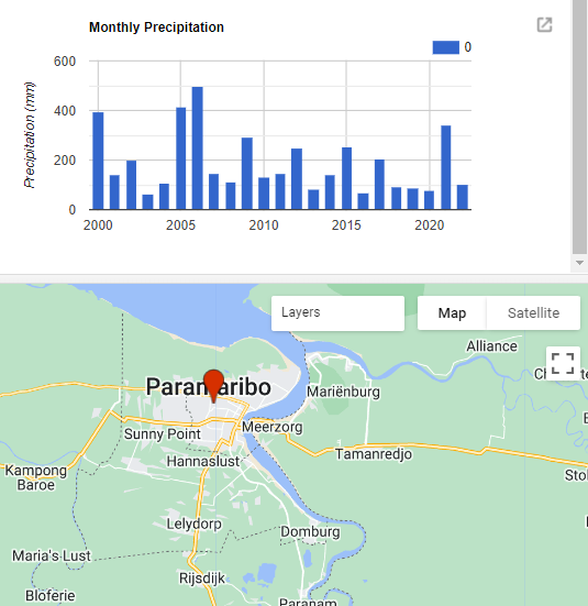
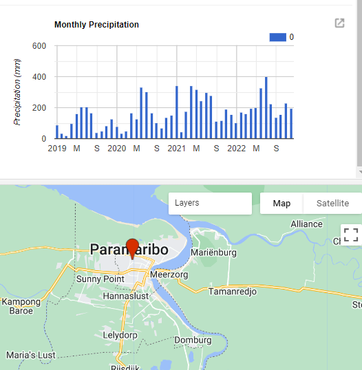
- How does the precipitation data look if we move our pin to the city of Paramaribo and run the script? Is the precipitation cycle look different than the previous location?
- Now, get the montly precipitation data from 2000 to 2022 and plot the data as a
LineChart. Where do you see the highest precipitation ver this period?
- Get monthly precipitation data of only January from 2000 to 2022, just change the list sequence values of the variable months to work with only this month. Plot it as a
ColumnChart. Where do you see the lowest and highest precipitation over 2000-2022?